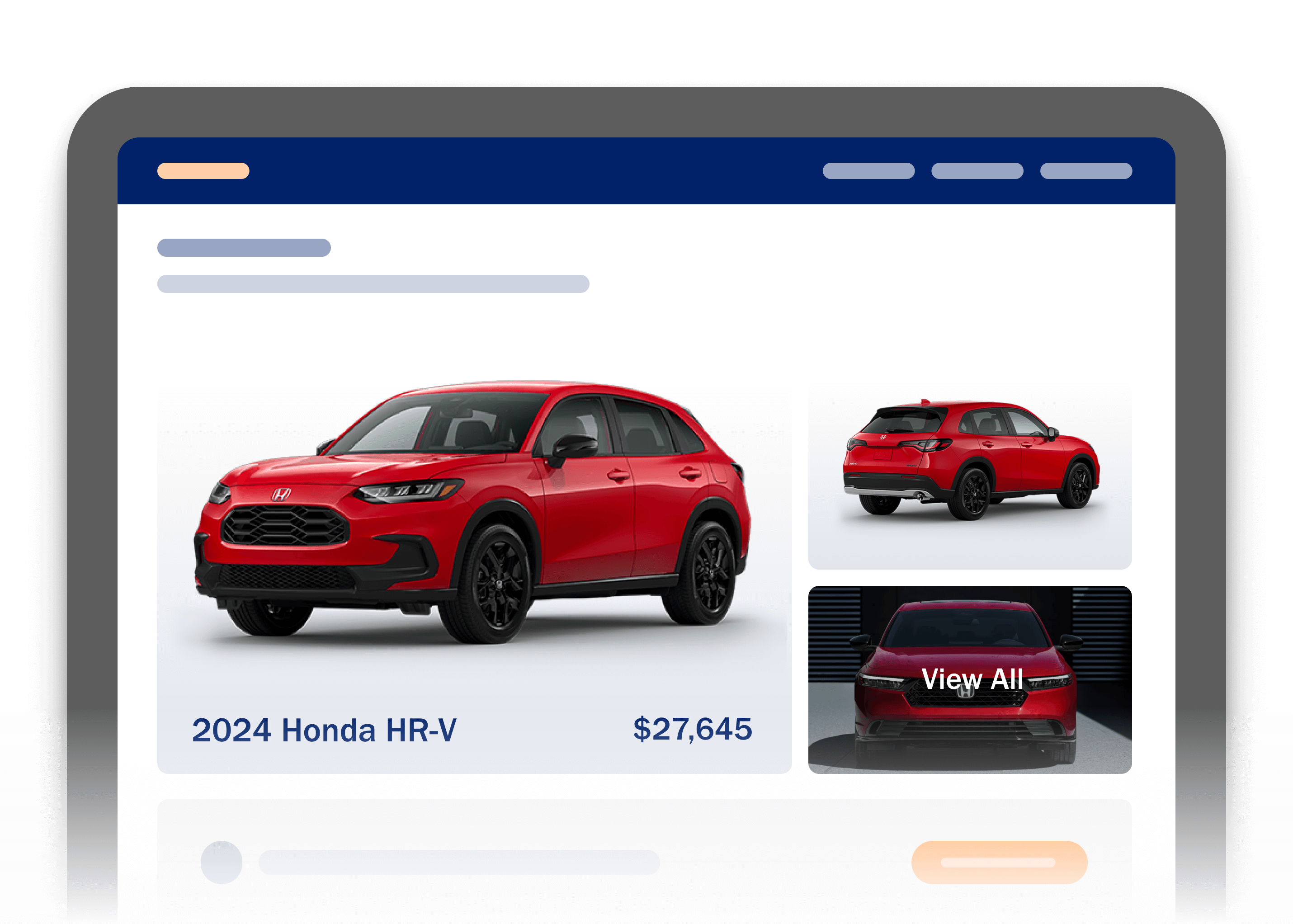
In today’s mobile-first world, your Vehicle Detail Page (VDP) needs to do more than just look good. It needs to work smart. Shoppers are browsing on their phones, and every button, banner, and sticky action plays a role in either helping or hindering their journey.
Here are three practical steps to streamline your CTAs and create a cleaner, more effective VDP experience:
- Declutter your mobile view by removing or repositioning irrelevant buttons.
- Avoid redundancy by consolidating buttons that serve the same purpose.
- Prioritize your primary CTA to guide shoppers toward your dealership’s main goal.
1. Remove Unnecessary Clutter
Start by viewing your VDP on your mobile device. Are there buttons that don’t relate to the vehicle being viewed?
Fixed buttons are often the culprit here. Because they follow the shopper as they scroll, they can overlap important content and disrupt the browsing experience. In many cases, these buttons don’t apply to the content being viewed.
If that’s the case, consider removing them. Buttons that are irrelevant to the vehicle can confuse shoppers and distract them from their goal. If removal isn’t possible, try repositioning them lower on the page, such as in the footer, to reduce visual noise.
Most dealership sites will only need one fixed button—typically for instant chat. Keeping these fixed buttons down to a minimum helps maintain a clean and focused experience.

2. Simplify Redundant Buttons
A common issue we see are buttons that serve the same purpose. Having multiple CTAs for contacting the dealership, applying for financing, or getting a trade-in estimate can overwhelm shoppers and lead to decision fatigue.
Audit your VDP for duplicate actions. If two or more buttons serve the same purpose, keep the one that performs best and remove the rest. If you choose to keep similar actions, group them logically so they complement each other without creating confusion.

3. Only Highlight the Most Important Button
Every dealership has a primary goal—whether it’s generating leads, encouraging phone calls, or gathering prequalified financing offers. Identify your top priority and make that your primary CTA. All other actions should support this goal, not compete with it.
Avoid the temptation to give too many CTAs primary weight. Doing so splits the shopper’s attention and weakens your overall strategy. If everything seems primary, you may find yourself trying louder ways to upstage your own primary button design to draw more attention.
This issue often arises when third-party buttons are added to the page. These buttons frequently come with their own styling and prominence, which can unintentionally compete with your primary CTA. If you include them, make sure they are truly adding value and not a distraction from your main objective.

Optimizing your CTAs is not just about aesthetics—it’s about strategy. By decluttering your VDP, removing redundant actions, and focusing on a single, clear call to action, you create a smoother, more intuitive experience for your shoppers.